 |
| About Bioline | All Journals | Testimonials | Membership | News |
|
||||||
|
||||||
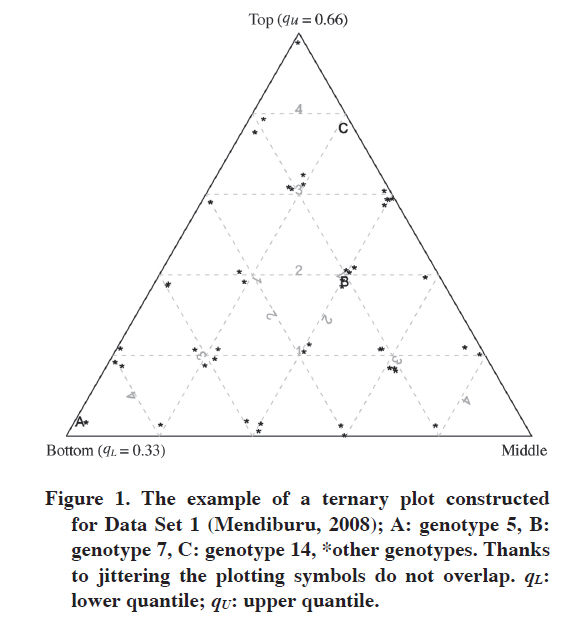
Chilean Journal of Agricultural Research, Vol. 70, No. 4, 2010, pp. 596-603 RESEARCH Visualizing Adaptation of Genotypes with a Ternary Plot Visualización de la Adaptación de Genotipos con un Gráfico Ternario. Marcin Kozak1 1Warsaw University of Life Science, Faculty of Agriculture and Biology, Nowoursynowska 159, 02-776 Warsaw, Poland. Corresponding author (nyggus@gmail.com). Received: 1 December 2009. Accepted: 9 April 2010. Code Number: cj10067 ABSTRACT Adaptation can be studied through various methods, some of which are based on adaptation or stability measures while others on complex models and graphs. In this paper a simple adaptation measure based on quantiles is presented; the measure is three-dimensional and can be pictured with a ternary (trilinear) plot. A simple algorithm for constructing such a plot is presented and the interpretation of the plot is discussed. By means of this graphical tool one can picture and interpret the specific and wide adaptation of genotypes to environments, offering complementary information to that of other methods of analyzing genotype-by-environment data. Key words: Adaptability, wide and specific adaptation, quantiles, trilinear plot, visualization. RESUMEN La adaptación puede ser estudiada a través de varios métodos, algunos de los cuales están basados en mediciones de adaptación o estabilidad, mientras otros en modelos complejos y en gráficos. En este artículo se presenta una medición simple de adaptación basada en cuantiles, la medición es tridimensional y puede ser visualizada como un gráfico ternario (trilineal). Se presenta un algoritmo simple para construir tal gráfico y se discute su interpretación. Por medio de esta herramienta gráfica se puede visualizar e interpretar la adaptación específica y amplia de genotipos a los ambientes, ofreciendo información complementaria a aquella de otros métodos de análisis de datos genotipos x ambiente. Palabras clave: adaptabilidad, adaptación amplia y específica, cuantiles, gráfico trilineal, visualización. INTRODUCTION In plant breeding, adaptation of plant varieties describes performance in terms of a trait of interest with respect to a given environment or given conditions (Annicchiarico, 2002; van Eeuwijk et al., 2005). A variety of wide adaptation performs well in most environments, while a variety of specific adaptation performs well in a subset of environments within a target region (Annicchiarico, 2002; van Eeuwijk et al., 2005), an example being a subset of environments under drought stress. Adaptation thus plays an important role in plant breeding, and genotype-by-environment interaction must not be ignored; modern analyses take this important aspect of breeding into account (e.g., Annicchiarico and Iannucci, 2007; Sabaghnia et al., 2008; Yamamoto et al., 2008; Mohammadi et al., 2007, 2009; Mohammadi and Amri, 2008). Genotype-by-environment data are analyzed with various methods (Gauch, 1992; DeLacy et al., 1996; van Eeuwijk et al., 2005), examples of contemporary ones being AMMI (Gauch, 1992) and GGE biplot (Yan and Kang, 2003). Both of them in a significant part are based on graphical tools. Nonetheless, these methods do not present adaptability in the way it is usually understood, that is, in terms of number of genotypes a genotype performs well (Annicchiarico, 2002). Genotype selection for multi-environment trials often employs various adaptation and stability measures (Ferreira et al., 2006; Sabaghnia et al., 2006). An interesting adaptation measure was discussed by Fox et al. (1990). It consists of stratified ranking of genotypes performed in each environment, by which one derives on the proportion of environments in which a genotype occurred in the top, middle and bottom thirds of the ranks; hence this is a three-dimensional measure, for each genotype three numbers are obtained. This interpretation refers to the definition of adaptation given in the first paragraph, because it describes adaptation in terms of number of environments in which a genotype performs well, or on average or poorly. Genotypes that occur mostly in the top third are characterized by wide adaptation (which is called adaptability, Annicchiarico, 2002). Genotypes that are in the top third in a small number of environments while being in the bottom third in many others are well adapted to these specific environments in which they perform well. This may be especially interesting if these environments have something in common (for example, they are characterized by drought stress). Fox et al.’s (1990) method is limited in a way that it separates the genotypes into three parts of equal count. In certain situations a plant breeder might be interested in another such separation, for example to detect really outstanding genotypes. Then the researcher might wish to set up the top group so that it contains genotypes being in the group of, say, 15% best genotypes in an environment. In this paper Fox et al.’s (1990) method was generalized in a way that based on quantiles of the trait of interest it can stratify genotypes into three strata subject to various such criteria. Then, to support interpretation of this approach, a ternary (trilinear) plot was proposed to picture genotype adaptation. By means of this plot, which is both concise and quite easy in interpretation, one can get the picture of the adaptation within the pool of genotypes studied and detect genotypes of wide or specific adaptation. The objectives of this paper were to present this ternary (trilinear) plot and to discuss its interpretation. MATERIAL AND METHODS Data Set 1 The first data set comes from the ‘genxenv’ data set of the agricolae package (Mendiburu, 2008) of R (R Development Core Team, 2009). Based on data from International Potato Center (CIP), Lima, Peru, the set contains yields of 50 potato (Solanum tuberosum L.) genotypes from five environments. Data Set 2 The second data set were first reported by Mungomery et al. (1974); it was taken from Basford and Tukey (1999). The set contains seed yield (t ha-1, mean of two blocks) of 58 soybean (Glycine max (L.) Merr.) lines, grouped into late (43 lines) and early (15 lines) ones, grown in eight environments (four Australian locations in 1970 and 1971). Generalization of Fox et al.’s (1990) approach Fox et al.’s (1990) approach stratifies genotypes in each environment into three strata (top, middle and bottom) based on ranks. We can generalize this approach by employing quantiles. Two quantiles, qL and qU, are chosen (L stands for “lower” while U for “upper”); below and in the discussion section some rules for this choice will be given. Then for each genotype in each environment a single value is assigned subject to the following formula: “top” [3] if Yge > qU, “middle” [2] if qL > Yge ≤ qU, “bottom” [1] if Yge ≤ qL, where Yge is the trait’s value of the gth (g = 1,…, G) genotype in the eth (e = 1,…, E) environment. Hence each genotype has as many values as there are environments (that is, E). Such data for a gth genotype are now transformed in the following way: Ig,top = number of environments for which the gth genotype has the “top” value, Ig,middle = number of environments for which the gth genotype has the “middle“ value, Ig,bottom = number of environments for which the gth genotype has the “bottom” value. Therefore, the following condition holds: E = Ig,top + Ig,middle + Ig,bottom for each gth genotype, g = 1,…, G. A fragment of a data set obtained in that way for Data Set 1 is presented in Table 1. These data can now be used to construct a ternary plot (see below). Table 1. The example of a data set transformed for the purpose of drawing a ternary plot. These are data for first five genotypes from Data Set 1 (Mendiburu, 2008). Number of environments equals 5, qL = 0.33, and qU = 0.66.
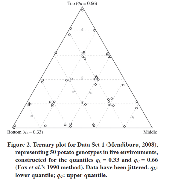
qL: lower quantile; qU: upper quantile Ig,top: number of environments for which the gth genotype has the “top”value; Ig,middle: number of environments for which the gth genotype has the “middle“value; Ig,bottom: number of environments for which the gth genotype has the “bottom”value. The choices of qL = 0.33 and qU = 0.66 are equivalent to Fox et al.’s (1990) approach. Choosing a higher upper quantile will lead to selection of very well performing genotypes, which hereafter will be called the outstanding genotypes. Such different choices of the upper quantile may detect different genotypes as having wide adaptation, it is possible that a genotype being in the top stratum for all environments for qU = 0.66 will be in the top in none environment for higher qU. We will discuss this point later in the paper. Ternary plot Ternary (trilinear, triangular, triangle, Harris 1999) plot is presented in triangular (barycentric) coordinates (Wilkinson, 2005) for a situation in which there are three variables of which the sum is constant for all cases. In agricultural and biological applications it is quite popular in presenting soil samples with three components (e.g., Podrabsky et al., 1998; Liebiens, 2001), but also in other applications (e.g., Dennis et al., 2004). The example of a ternary plot constructed for Data Set 1 (Mendiburu, 2008) is presented in Figure 1. Instead of standard plotting symbols (open circles should work very well for many genotypes, see Cleveland [1994] for the discussion on optimum plotting symbols), the asterisk was used for 47 genotypes and letters A, B and C for genotypes Nº 5, 7 and 14, respectively. Jittering (Cleveland, 1994) of the data was employed to prevent severe overlapping of the points (otherwise genotypes that are adjacent in Figure 1 would be plotted in the very same point). Reading the plot is quite simple: focusing on a particular axis, one needs to choose those grid lines which are parallel to this axis. For example, if one wants to learn Ig,top (number of environments for which the gth genotype has the “top” value) for a particular genotype, one should focus on the horizontal grid lines. This is very simple when the number of environments is 5 or when 5 is its factor, then the grids can be labelled with natural values; otherwise such grid labels do not make sense, and some other labels need to be used (Figure 4 for frequency-based labels). Note, however, that the main aim of the ternary plot is to picture adaptation, not to facilitate table look-up of the data for the genotypes. Let us focus on the genotypes A, B and C from Figure 1. Genotype A is not adapted to any of the environments: It is in the bottom stratum for all of them. Genotype C, on the other hand, is characterized by wide adaptation, it is in the top stratum in four environments and in the middle stratum in one environment. Genotype B is in the top stratum in one environment, in the middle stratum in three environments, and in the bottom stratum in one environment. Hence the more often the genotype is in the top stratum, the higher it is in the plot; among those who are at the same height, better are those which are on the right of the plot than those on the left. Note that as is done in biplots, genotypes in the ternary plot can be labelled with numbers or names; when there are too many of them, or when some serious overlap of points occur, they should be presented with standard plotting symbols, mentioned above. When analyzing the results, the graph should be supported by a table similar to Table 1, but with genotypes sorted decreasingly by (in order) Ig,top, Ig,middle and Ig,bottom. In such a table one can easily find names of the genotypes with similar Ig values. Interactive visualization can be of much help in interpretation of ternary plots representing many genotypes. The plots were constructed with the function ternary plot of vcd package (Meyer et al., 2008) of R (R Development Core Team, 2009). The R code to draw the plots can be obtained from the author. RESULTS Data set 1 Figure 2 shows a ternary plot for Data Set 1 (Mendiburu, 2008) corresponding to Fox et al.’s (1990) approach. We see that one genotype (Nº 27, Table 2) was in the top stratum in all five environments, one (Nº 14) was in the top stratum in four environments while being in the middle stratum in one environment, and two (Nº 9 and 15) were in the top stratum in four environments while being in the bottom in one environment. There were nine other genotypes that were in either top or middle stratum in all environments. All these genotypes are characterized by wide adaptation. Two genotypes (Nº 5 and 46) were in the bottom stratum in all environments. The four genotypes from the top and two from the bottom left of the graph are presented in Table 2. Table 2. The four best and the worst two genotypes according to Figure 2, sorted decreasingly by Ig,top, Ig,middle and Ig,bottom.
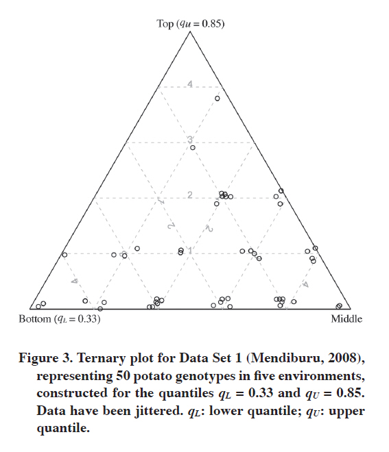
Ig,top: number of environments for which the gth genotype has the “top”value; Ig,middle: number of environments for which the gth genotype has the “middle“value; Ig,bottom: number of environments for which the gth genotype has the “bottom”value. We can be more strict and increase the upper quantile to qU = 0.85 in order to find the outstanding genotypes (Figure 3). Such an upper quantile together with qL = 0.33 makes us choose about 15% of the genotypes within the top stratum, about half of the genotypes in the middle stratum and about one-third of the genotypes in the bottom stratum. Note that in that way the assignments to the bottom stratum do not change, but for the top and middle strata they can. And indeed they changed in our analysis; in fact, they changed more than it can be seen when comparing Figures 2 and 3 (Table 3). Now only one genotype (Nº 14) is in the top stratum in four environments, and one (Nº 13) in three environments. Note that genotype 27, which was clearly the best in Figure 2, in Figure 3 is in the top stratum in only one environment, and in the middle stratum in four environments, hence this genotype is not even among the best 11 genotypes presented in Table 2. Genotype 15 is not among those either despite being in the top stratum for Fox et al.’s (1990) method. The assignment to strata for genotype 13 did not change, but in Figure 3 it appears to be one of the two best genotypes. Note that while in Figure 2 there were quite a few genotypes that were in the top stratum for some environments and in the bottom for others (which might suggest specific adaptation), in Figure 3 there is only one such genotype (Nº 20). Note that for wide adaptation it is required not only that a variety performs very well in most environments in the target region, but also that in others it does not perform bad, it should perform at least at the medium level; this can be detected on the ternary plot. Table 3. Eleven best genotypes according to Figure 3, sorted decreasingly by Ig,top, Ig,middle and Ig,bottom. The results for qU = 0.66 are given for comparison.
qU: upper quantile; Ig,top: number of environments for which the gth genotype has the “top”value; Ig,middle: number of environments for which the gth genotype has the “middle“value; Ig,bottom: number of environments for which the gth genotype has the “bottom”value.
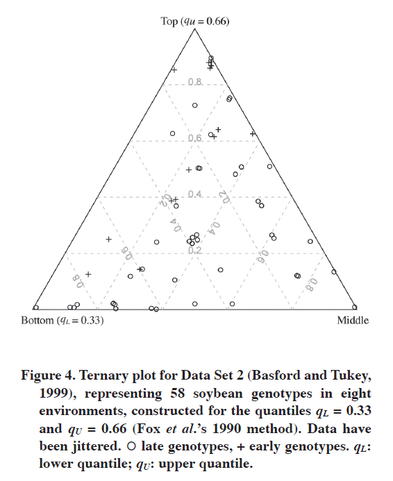
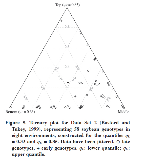
Data Set 2 With this data set we can show the efficiency of the ternary plot in comparing adaptation of two groups of genotypes. Of course, one is not limited only to two groups. Figure 4 shows the ternary plot for Fox et al.’s (1990) approach. Early and late genotypes are presented with different plotting symbols, which make comparing them easy. As mentioned before, here we have eight environments, so instead of integer labels for grid lines we have frequencies (for many environments such grid lines have clear interpretation, they show fractions of environments in which a genotype is in the corresponding stratum). This is not a problem because we do not need to read all the information from the plot, it aims to picture the data rather than to enable one looking up the Ig values; this can be done from the corresponding table. In Figure 4 we can see that in general early genotypes are better adapted to the eight environments, five of them are in the top stratum in seven environments while being in the middle stratum in one; only one late genotype is equally adapted. In addition, one early genotype is in the top stratum in seven environments while being in the bottom one in one environment. Increasing the upper quantile changes these results (Figure 5). Now the superiority of early genotypes is even more apparent: only two late genotypes are in the top stratum in four environments, while eight early genotypes are in the top in four or more environments. DISCUSSION The choice of lower and upper quantiles matters. In the above examples it was shown that changing the upper quantile can affect interpretation of the graph. The question one has to answer when deciding on the quantiles is what interpretation one strives for. This can also depend on the number of genotypes. It is impossible to give detailed rules that would work in every situation, but some general rules are as follows. First, one needs to decide whether one looks for outstanding genotypes or those that are stable yielding at medium to high level in the environments. For the former, the upper quantile should be high; for the latter, it does not have to. In general, the higher the upper quantile is, the more difficult will be for a genotype to be assigned as high-yielding. The aim of the lower quantile is to detect really poorly yielding genotypes. The general suggestion is to precisely define the bottom, middle and top strata. Table 4 gives some examples of such definitions. Of course there is freedom in choosing the quantiles, but they should be informative, the 0.33 and 0.66 quantiles are informative as they split the pool of genotypes into three equal parts. In Table 4 these three parts are referred to as poor, medium and well-yielding genotypes, respectively (the group of well-yielding genotypes includes also outstanding ones). The outstanding genotypes are defined by 0.85 upper quantile, which means that about 15% of the best genotypes in an environment are thought of as outstanding; this is, of course, a generalization that does not have to work well for each environment (that is, these best genotypes do not have to be outstanding). This quantile can be moved to 0.90 if there are very many genotypes, but too high an upper quantile is rather undesirable because it is difficult to expect that in there will always be at least several genotypes that are outstanding in several environments. Most of those really good ones would be in the middle stratum, grouped with those which yield at medium level. Table 4. Examples of various choices of lower and upper quantiles for a ternary plot and the interpretation of strata constructed in that way.
qL: lower quantile; qU: upper quantile. The ternary plot offers no information about environments, which is the limitation especially in the case of specific adaptation. This is because one cannot learn if a small subset of environments in which a particular genotype performs well is in any way related; if not, that is, if there is nothing really in common in these environments, then such specific adaptation is rather not specific per se and would rather not be of interest for a plant breeder. CONCLUSIONS The ternary plot presented in this paper efficiently visualizes wide and specific adaptation represented by number of environments in which a genotype performs outstandingly or well. The information and interpretation if offers is deeper than stability and adaptation measures, quite popular these times (e.g., Sabaghnia et al., 2006; Mohammadi et al., 2007; 2009; Mohammadi and Amri, 2008). Similar information would be very difficult to access from the corresponding table, especially when the number of genotypes and environments is big. Of course, if one wants only to select the best genotypes, it can be done based on the table; however, the ternary plot can tell a much more detailed story. This plot can be thought of as a complementary technique to other methods of analyzing genotype-by-environment data, for example AMMI (Gauch, 1992), GGE biplot (Yan and Kang, 2003) and others. The ternary plot bases on the approach being the generalization of Fox et al.’s (1990) measure of adaptation. This does not mean that this plot is limited to this type of approach; genotype adaptation and stability offer plenty of measures and approaches, and for some of them the ternary plot can be employed to support interpretation. This gives space for further research. ACKNOWLEDGEMENTS I would like to thank Prof. Wiesław Mądry and Mrs. Marzena Iwańska for discussions about adaptation and stability. LITERATURE CITED
Copyright 2010 - Chilean Journal of Agricultural Research The following images related to this document are available:Photo images[cj10067t4.jpg] [cj10067f4.jpg] [cj10067f1.jpg] [cj10067f3.jpg] [cj10067f5.jpg] [cj10067t2.jpg] [cj10067t3.jpg] [cj10067f2.jpg] [cj10067t1.jpg] | |||||||||||||||||||||||||||||||||||||||||||||||||||||||||||||||||||||||||||||||||||||||||||||||||||||||||||||||||||||||||||||||||||||||||||||||||||||||||||||||||||||||||||||||||||
| |||||||||