 |
| About Bioline | All Journals | Testimonials | Membership | News |
|
||||||
|
||||||
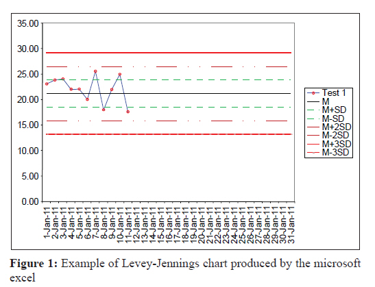
Indian Journal of Medical Microbiology, Vol. 29, No. 4, October-December, 2011, pp. 448-449 Correspondence Use of the microsoft excel for automated plotting of Levey Jennings charts D Sharma Department of Lab Medicine, Max Super Speciality Hospital Phase 6, Mohali, India Date of Submission: 11-May-2011 Code Number: mb11114 PMID: 22120820 Dear Editor, Levey-Jennings charts (LJ charts) are crucial for the internal quality control of a clinical laboratory. [1],[2],[3],[4] I found a novel way for automated plotting of monthly LJ charts by using Microsoft excel. In the LJ chart, quality control data is plotted in the form of a graph, in which time (dates) is represented on the x-axis and numerical value of quality control test is represented on the y-axis. The LJ chart contains several reference lines, including one reference line for mean and three reference lines on either side of the mean representing standard deviation limits (1SD, 2SD and 3SD). [1],[2] To plot LJ chart, dates, and control test data were entered in the upper two rows of the excel sheet. In the subsequent seven rows (reference data rows), values of mean and SD limits (reference values) were entered. Each reference data row was dedicated to one reference value, and the same reference value was entered in all the cells of the row. To do it conveniently, first the formulae for calculating the Mean ′ = AVERAGE(B2: AF2)′ and SD ′ = STDEV(B2: AF2)′ were entered in the control data row, after leaving two cells blank from the last data-cell of the month. (Here, B2 and AF2 are the references for the first and last cells of the control data. Here the letters are indicating the columns and numbers are indicating rows. One can change the cell reference to include or exclude the data cells in the formula.) After that, appropriate formulae were entered in the first cell of each reference data row for automated calculation of respective reference value (e.g. formula for mean + 1SD is ′ = AI2 + AJ2′. Where AI2 is the reference for the cell containing formula for mean and AJ2 is the reference for the cell containing formula for SD. Similarly for calculating mean-2SD the formula is ′ = AI2 - (2*AJ2)′. Here the reference of cell containing SD is multiplied by 2 and subtracted from the reference of cell containing mean. In the same way other formulae were given. Care was taken to enter the references correctly.). Then after, the reference of the first cell was entered in the subsequent cells of the respective reference data rows up to the last column of the month by using the fill handle feature of the excel sheet (e.g. ′ = $B$3′ is the reference of the first cell of 3 rd row which was filled in the subsequent cells of the row. Column A was used for entering data labels ′M, M+SD, M-SD, M+2SD, M-2SD etc′ and cells of column B were assumed as first cells for the data). Fill handle is the lower right corner of any cell in excel sheet, when we click over it and drag it over a range of cells, excel automatically copies the same value into these cells. After doing this, when the quality control test data was entered in the designated row, the excel sheet automatically calculated the values of mean and SD and filled the values of mean and SD limits in the respective reference data rows. With each new data entry, all these values were updated. Now after selecting this data, the LJ chart was prepared by simply pressing the F11 key, and by selecting the chart type as line chart. Formatting of the chart was done for better presentation. To increase the accuracy of SD, 15 extra columns were inserted on the left side of the first column of the data. Now in the initial 15 cells of control data row, data of 15 days of last month was fed. These 15 extra cells were included in the formula for calculating SD, but were not included in the chart. After inserting these extra cells, the references for SD calculating formula were adjusted to include these cells, references for other formulae were automatically adjusted by excel. After plotting the LJ charts, reference data rows and columns containing last month′s data were hidden by using the hide command of excel. By doing so the reference rows were not visible and worked in the background to plot the LJ charts. [Figure - 1] shows one of the LJ chart plotted using this method. References
Copyright 2011 - Indian Journal of Medical Microbiology The following images related to this document are available:Photo images[mb11114f1.jpg] |
| |||||||||